 MathCS.org - Statistics
3.5. Bending the Rules
Using graphical data representation provides a great opportunity to visualize data so that it conveys a particular point of view. This is not cheating, it is simply using some visual aides to make your data appear to support one particular point of view over another without actually changing the data.
Here is, for example, a table of how much different states spend per students in dollars in 1980:
State $ per Student State $ per Student Arkansas $1219 Idaho $1345 Mississippi $1189 New Jersey< $2576 North Dakota $1607 Washington
$2079
If we insert a vertical bar chart as described in a previous section without picking any options, it might look similar to the following:
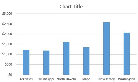
It is easy to see that New Jersey spends the most per student, about twice as much as states like Arkansas or Mississippi. The difference between NJ and AK is pretty clear.
Now suppose we want to give a presentation in which the state of Arkansas looks reasonably good as compared to the state of New Jersey. We could create a bar char that minimizes the differences in state spending by using a particularly "large" scale on the y-axis:
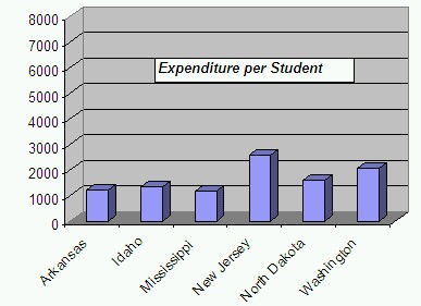
We are also de-emphasizing the empty space that results in choosing a large y-scale by placing the chart title into that area. In this chart it is still clear that NJ spends the most per student - after all, we can not change the actual data - but the difference does not look quite so stark any more. As another option, we could remove the vertical gridlines to make it harder to see exactly how much money the different states actually spend.
Now let's try the opposite: we want to give a presentation in which the state of Arkansas looks very bad as compared to the state of New Jersey. Thus, we pick a scale on the y-axis that makes sure that the difference between Arkansas and New Jersey appears as larges as possible. In particular, we choose a y-scale that starts at 1000 and ends at 2400, instead of more standard values such as 0 to, say, 3000.
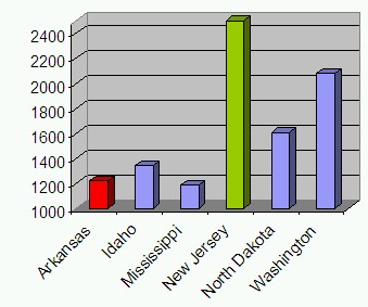
We also picked an "aggressive" color (red) for the Arkansas figure and a "calm" color (green) for New Jersey, emphasizing the fact that we want to represent Arkansas as "bad" and New Jersey as "good". In this chart AK looks pretty bad compared to NJ - in fact, it seems as if NJ spends many times more money per student than AK - but w have not changed the actual data values.
All three charts represent the same data and they are perfectly valid. Yet visually they tell different stories. There are many other tricks that are used frequently to represent data in such as way as to support one particular point of view without outright misrepresenting reality.
Exercise: Support you have some data showing the cases of H1N1 flue infections per region as follows:
- Region 01 - Boston: 215
- Region 02 - New York: 229
- Region 03 - Philadelphia: 193
- Region 04 - Atlanta: 301
- Region 05 - Chicago: 1788
- Region 06 - Dallas: 734
- Region 07 - Kansas City: 164
- Region 08 - Denver: 175
- Region 09 - San Francisco: 1080
- Region 10 - Seattle: 420
If you were a health official in Dallas, you might want to use this data to try to get people in your region to vaccinate against the H1N1 flue. Thus, you are trying to create a chart that emphasizes the number of cases in Dallas versus the other regions so that your citizens are motivated to get vaccinated. Here are a few suggestions:
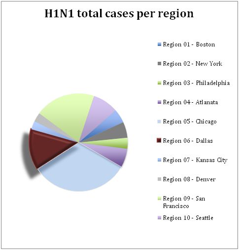
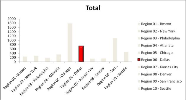
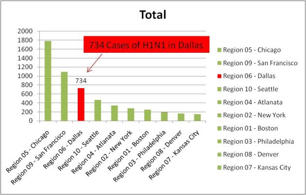
Which of these charts do you like the best? Create your own chart to emphesize the figure in "Region 06 - Dallas".
Try this: Check your local newspaper or online news source to find some charts. See if these charts try to promote any particular point of view or if they are relatively neutral.