 MathCS.org - Statistics
6.2 Scatter Plots
So far we have seen how to determine whether two variables are independent (Chi-Square test for categorical variables) or linearily related (correlation coefficient for numeric variables). In this section we will investigate the exact nature of the relationship, if any, graphically.
We will, in particular, look at situations where there is a (suspected) causal relationship where one variable causes particular values of another variable. In other words, we will look at situations where two variables are related in such a way that if one is known the other one can be computed. In such cases, "scatter plots" are a convenient tool to represent both variables and their (possible) relationship.
Dependent and Independent Variables
If there is a relationship between two variables in such a way that knowledge of the first allows the computation or prediction of the second, then the first variable is called the independent variable - usually denoted by x - while the second is called the dependent variable - usually denoted by y.
Note: in practice, the independent variable often refers to a time prior to that of the dependent variable.
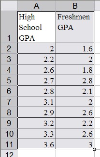
Example: A group of 11 students was selected at random and asked for their high school GPA and their freshmen GPA in college the subsequent year. The results were:
Student High School GPA Freshmen GPA 1 2.0 1.6 2 2.2 2.0 3 2.6 1.8 4 2.7 2.8 5
2.8
2.1
6
3.1
2.0
7
2.9
2.6
8
3.2
2.2
9
3.3
2.6
10
3.6
3.0
We would like to know whether there is a (linear) relationship between the high school GPA and the freshmen GPA, and we would like to be able to predict the freshmen GPA, if we know that the high school GPA of another student is, say, 3.4.
Since students go to high school prior to going to college, the high school GPA refers to a time before that of the freshmen GPA. Therefore the high school GPA is the independent variable called x, while the freshmen GPA is the dependent variable called y. That makes sense since it is conceivable that the high school GPA determines the freshmen GPA but not the other way around.
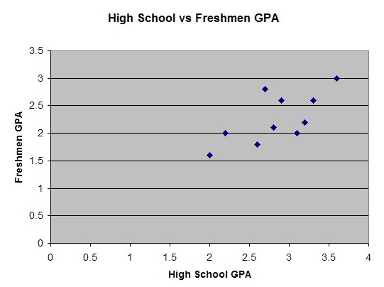
We will see how prediction works in the next section. Right now we simply want to visualize the data to "see" if there is a relationship between the high school and freshmen GPA. With our choice of x and y the above table translates into a series of (x, y) data points:
(2.0, 1.6), (2.2, 2.0), (2.6, 1.8), (2.8, 2.1), (3.1, 2.0), (2.9, 2.6), (3.2, 2.2), (3.3, 2.6), (3.6, 3.0)
We can now plot these points in a standard Cartesian coordinate system and then, hopefully, we will simply see whether there is a relation between x and y or not. Of course, we will use Excel to actually generate the graph for us:
- Start, as ususal, Microsoft Excel, with an empty spreadsheet
- Label the first two columns "High School GPA" and "College GPA", respectively. Don't worry if you can't see the first label in its entirety.
- Enter the data in columns, the high school GPA in the first column, college GPA in the second
- Use the mouse to mark all data, labels as well as numbers. Then click on the "Insert" ribbon and select "XY (Scatter)" as chart type.
- You can customize the chart to make it look more to your liking. In our case, for example, we can double-click on the "X" axis (horizontal axis) to change the scale so that the minimum value starts at 1.8. We can also click on the "Y" axis (vertical) to change its scale so that it also starts at 1.4. After all, there are no values less than 1, so why not start the axis at that number instead of at zero. Here is a possible final version of the chart (where we have also changed the background color of the chart):
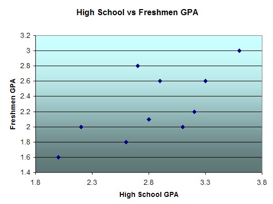
Now that we can "see" the data it seems that there is indeed some loose relationship between high school and college GPA. Generally speaking, low high school GPA's result in low college GPA's, higher high school scores result in better college performance, and in general college grades are somewhat worse than high school grades.
If we did compute the correlation coefficient (from the previous section) is would come out to be 0.69665, confirming that there is some linear relationship between the variables but not a strong one.
In the next section we lean a precise way to determine the linear equation relating x and y and to use the projected relation to make predictions for values that are not part of the original data set.