 MathCS.org - Statistics
3.4 Frequency Histogram
The previous chart types work well for categorical data since there are ususally a limited amount of categories. The most important type of graphical data representation for numerical data is a Frequency Histogram, or histogram for short. Let's consider an example:
Example: In an anonymous survey of students in a stats course (like the one you filled out at the beginning of the class) you were asked your sex, male or female. Here are the responses received:
2, 1, 2, 1, 2, 1, 2, 1, 2, 1, 1, 1, 2, 1, 1, 2, 1, 2, 2, 2, 2, 2, 2, 2, 2, 1, 1, 2, 2, 2, 2, 2, 2, 1, 2, 1, 2, 2, 1
where 1 = male and 2 = female.
First, as a quick review, is this a numeric, nominal, or ordinal variable - I hope you're thinking "nominal" and you don't get fooled by the minor detail that the values are all numbers (which are merely code for the categories).
Second, a usual bar chart (or pie chart) would not work well. I am not really interested in the fact that some responses were 1, others were 2. Instead I want to know how many 1's (men) and how many 2's (women) there are, or in the frequencies of the various responses. In this case I could (relatively) easily count the values manually to find the following frequencies:
Frequency Male (1) 15 Female (2) 24 Totals 39
This frequency table tells me, for example, that more women than men are taking this stats class. Also, if I meet a person from this class completely at random on the street, there is a "15 in 39" chance it is a man and a "24 in 39" chance it's a woman (we'll do some probability theory later but this should make common sense).
In the above example we could generate our frequency table manually easy enough, and we could subsequently use that table to generate an appropriate chart. But if we have hundreds or thousands or responses, we would like to use Excel to generate the frequency table and associated chart. Also, it may not be completely clear in which category responses fall. especially if the variables are numeric. As usual, Excel will provide a relatively convenient method for us to automate our calculations.Example: Many communities add fluoride to water to prevent tooth decay. In a 25 day period, these levels of fluoride were measured:
75, 86, 84, 85, 97, 94, 89, 84, 83, 89, 88, 78, 77, 76, 82, 72, 92, 105, 94, 83, 81, 85, 97, 93, 79
There are too many numbers for pie or bar chart, and in fact we are not interested in the actual numbers as much as we are interested in the frequency with which they occur. Hence, we want to group them into categories, and then graph the frequency counts of these categories instead of the original numbers.
As mentioned, we will use Excel to create such a frequency histogram. This time, however, we will not use the Chart Wizzard but instead our first procedure from the Analysis ToolPak.
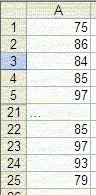
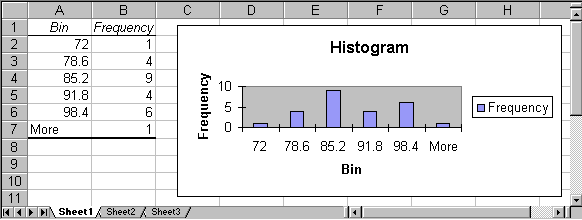
- Start Excel and enter the above numbers, all in one column. You do not need to enter a title or anything else, just the numbers in one column. Note that the picture only shows the first and last few numbers, but you should, of course, enter all numbers in the first column.
- Now bring up the "Data Analysis ..." dialog (remember, it is available on the "Data" ribbon). If you do not see this item, you must first install the "Analysis Pak", as described previously. Anyhow, a dialog box similar to the following will appear
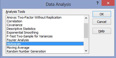
- Highlight the entry "Histogram", as in the above picture, then click on "OK".
The "Histogram" tool is appropriate to compute frequency tables and charts for numeric variables. You could continue reading the instructions or check out the video if you prefer:
To continue with the instructions, you need to enter the options for a (frequency) histogram next, including the location of the data to be used and the categories that you want to use.
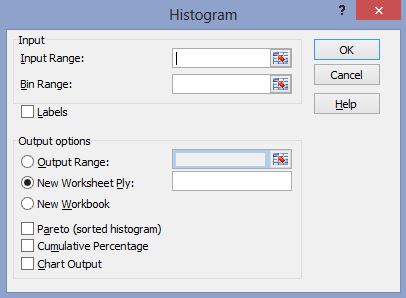
The various options in this dialog box need further explanation (click on "Help" inside that dialog box):
Input Range Enter the reference for the range of data you want to analyze. Bin Range: [optional] Enter the cell reference to a range that contains an optional set of boundary values that define bin ranges. These values should be in ascending order. Excel counts the number of data points between the current bin number and the adjoining higher bin, if any. A number is counted in a particular bin if it is equal to or less than the bin number down to the last bin. All values below the first bin value are counted together, as are the values above the last bin value. If you omit the bin range, Excel creates a set of evenly distributed bins between the data's minimum and maximum values. Labels Check this if the first row or column of your input range contains labels. Clear this check box if your input range has no labels; Excel generates appropriate data labels for the output table. Output Range: Enter the reference for the upper-left cell of the output table. Excel automatically determines the size of the output area and displays a message if the output table will replace existing data. New Worksheet Ply Click to insert a new worksheet in the current workbook and paste the results starting at cell A1 of the new worksheet. To name the new worksheet, type a name in the box. New Workbook Click to create a new workbook and paste the results on a new worksheet in the new workbook. Pareto (sorted histogram) Select to present data in the output table in descending order of frequency. If this check box is cleared, Excel presents the data in ascending order and omits the three rightmost columns that contain the sorted data. Cumulative Percentage Select to generate an output table column for cumulative percentages and to include a cumulative percentage line in the histogram chart. Clear to omit the cumulative percentages. Chart Output Select to generate an embedded histogram chart with the output table.
There are a lot of options, perhaps confusing ones, but the only mandatory option is the input range. In our case, we need to enter the data range (the cells containing the data) and we need to make sure that the option "Chart Output" is selected. Excel provides an easy method to select the data range (or many other cell ranges within dialog boxes).
In the above dialog box, you will notice three "cell selector" icons
(for the "Input Range", the "Bin Range", and the "Output Range")
In our case,
you should click on the cell selector icon
![]() next to the "Input Range". The "Histogram" dialog box will
temporarily shrink and you can now use the mouse and/or cursor keys
to select the appropriate cells by highlighting them:
next to the "Input Range". The "Histogram" dialog box will
temporarily shrink and you can now use the mouse and/or cursor keys
to select the appropriate cells by highlighting them:
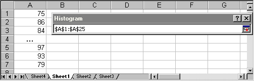
When you have selected the appropriate cells, click the "Return" icon in the small "Histogram" dialog to return to the original "Histogram" dialog box. You should now see the text "$A$1:$A$25" as "Input Range".
Next, we should determine the "bins" that in turn will determine the category boundaries. However, for a "quick" histogram, we do not need to fill in the bin range and instead Excel will compute the highest and lowest data point and subdivide the values automatically into evenly divided categories. In other words, for this particular example we will leave the "Bin Range" empty (we will provide a second example where we manually determine the categories, or bins).
We can now choose to display a frequency table only, or a frequency table together with a histogram chart, simply by selecting or de-selecting "Chart Output". We have done that (i.e. frequency table plus chart), and the output looks similar to the following:
As usual, we can now customize our chart by double-clicking on its components to replace the various titles by more meaningful names, and removing the "Frequency" label. Out final histogram might look like this:
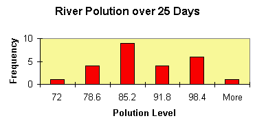
We have changed the color of the frequency bars to red, the background to light brown, and we have replaced the various titles by more appropriate names.
In this example Excel determined the categories for our numeric variable (the "bins") automatically. Excel decided:
- category 1 goes from 0 to 72 and includes 1 measurement
- category 2 goes from 72 to 78.6 and includes 4 measurements
- category 3 goes from 78.6 to 85.2 and includes 9 measurements
- category, 4 goes hour 85.2 to 91.8 and includes 4 measurements
- category 5 goes from 91.8 to 98.4 and includes 6 measurements
- category 6 includes everything above 98.4 and includes 1 measurement
This means, for example, that on 9 of the 25 days measured the pollution was between 78.6 and 85.2.
By the way, I hope you notice that this description of the categories leaves room for for interpretation. Where, for example, would a value go that is right on the border between two bins? For example, would a measurement of 78.6 fall into category 2 or in 3? What do you think will Excel decide in a borderline case such as this? As a hint, look at the last two categories and generalize from there.
Practice: Open the Excel spreadsheet linked below. It shows the age of respondents to a survey. Generate a frequency histogram and determine if the variable is homogeneous or heterogeneous. Use the default number of categories Excel comes up with.
Excel's histogram tool works well for numeric variables, but in case the variable is not numeric another procedure works better and we will outline that in a subsequent section. In our next example, however, we assume we do have a numeric variable and we are interested in defining the categories (aka bins) ourselves. This is usually not necessary but is useful, particularly for large data sets. but if you are pressed for time you may skip this portion and perhaps mark it for review at a later time. As a reward for those not adverse to a challange, you'll get to analyze the salaries of Major League Baseball players over the past decades and the end of this section; interesting stuff indeed!
Please note that Excel's default categories for numeric variables usually (but not always) work fine, but it is sometimes necessary to have a specific number of categories. The procedure to define your own categories is perhaps a little more complicated than our previous procedure but - we will look at it as an opportunity, not a difficulty ...
Example: A study was done that measured heights of widgets produced in a certain factory. Here are the results:
3, 2, 5, 1, 4, 11, 3, 8, 23, 2, 6, 17, 5, 12, 35, 3, 8, 23, 6, 14, 41, 7, 16, 47, 8, 18, 53, 10, 22, 65, 9, 20, 59
Construct a frequency table with associated chart using five categories and again using eight categories.
As usual, start Excel and enter the above data, all numbers in one column.
Before we can generate the histogram using the "Data Analysis ..." menu entry we need to perform a few calculations so that we get the desired number of categories. In the previous example Excel handled the category selection automatically, but this time we want to specify bounds so that we get exactly 5 (or 8) categories. Here is what we have to do:
- Decide on the number of categories you want (usually between 5 and 10)
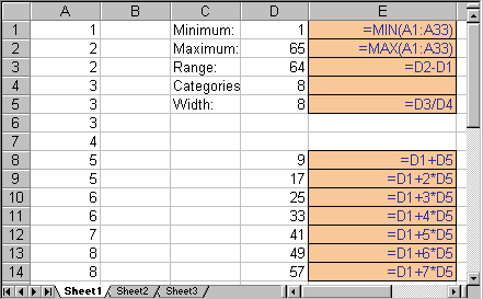
- Compute the minimum (smallest) value of our data
- Compute the maximum (largest) value of our data
- Compute the range of our data, i.e. range = maximum - minimum
- Compute the width of each category, i.e. width = range / (number of categories)
- Find the separation points for each category, given by:
- minimum + 1 * width
- minimum + 2 * width
- ...
- minimum + (n-1) * width
where n is the number of categories we want.
This could be done easily by hand, but Excel provides formulas for doing this as well. In fact, a by-hand computation (with the help of a simple calculator is probably easier - and you should most definitely do that - but since we are committed to Excel, I'll show how to do it with Excel formulas.
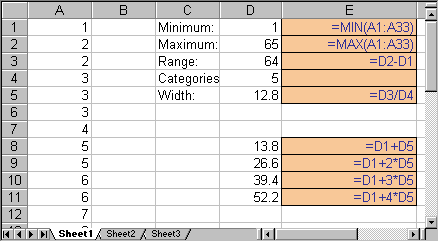
In the picture below, we show the results of these computations, together with the formulas that yield the various numbers:
The formulas, displayed in blue on light brown background, are actually entered in place of the numbers shown in the above picture, i.e. you will not see those formulas in the actual Excel spreadsheet. To recall how to enter formulas like these, please refer to a previous section.
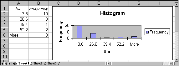
Note that there are four category breakpoints, which will result in five categories:
- numbers below 13.8, including 13.8
- numbers bigger than 13.8 and less than or equal to 26.6
- numbers bigger than 26.6 and less than or equal to 39.4
- numbers bigger than 39.4 and less than or equal to 52.2
- numbers bigger than 52.2
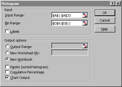
Now we proceed just as before, but this time we will select the cells D8 to D11 as "Bin Range" in addition to the previous example. In other words:
- Select "Data Analysis ..." from the "Tools" menu
- Select "Histogram" and click on "OK"
- Select as "Input Range" the cells containing the data numbers, in our example A1 to A33
- Select as "Bin Range" the cells containing the numbers in D8 to D11
- Select the option "Chart Output" and, by necessity (as mentioned above), also "New Workbook" for the output
Click on "OK" to produce a frequency chart similar to this one:
It is now very simply to create a frequency table and chart with 8 (or any other number of) categories: in the original spreadsheet, simply change the number of categories from 5 to 8 (which will change the "Width" as well as the current category cutoff points) and add 3 additional cutoff points (using the appropriate formulas):
Select again "Histograms" from the "Data Analysis ..." entry of the "Tools" menu, but make sure that the "Bin Range" now contains the new cutoff points just computed. The final result will look similar to this:
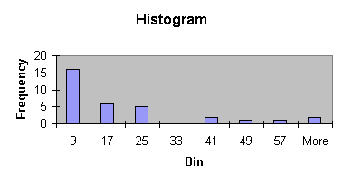
Of course we could again change the corresponding titles, colors, ranges, etc. by double-clicking on them. By the way, do you think this is a homogeneous or heterogenous distribution - I hope you're thinking that most values clump around the category 9, which would indicate it is - if you had to decide - homogeneous. And note that you would arrive at the same conclusion if you had considered the previous histogram with 5 bins.
Practice: The next Excel spreadsheet contains data for salaries of Major League Baseball player from 1988 to 2011. Open the data files and create a histogram for the salary variable. Think about whether it is actually a good idea to create this histogram. Perhaps there is some problem with this, some information that you don't quite capture if you create a historgram for the entire data?
In this video you will see what happens when you let Excel pick the bin width automatically for a large data set:
As you can see above, Excel did not pick very good bins automatically. Thus, we will repeat the exercise, but this time we will compute the bins manually. Check out the following video: