 MathCS.org - Statistics
back | next
3.6. Frequency Charts for Categorical Variables
Often one would like to know the frequency of occurrence of values for a variable in percent. This is similar to a frequency histogram we studies earlier, but a histogram only applies to numerical variables, while the procedure outlines in this section will apply to categorical variables. Unfortunately the procedure is somewhat lengthy, but with a little bit of practice it should not be too bad.
Example: A survey was conducted in the summer of 2004, asking several students in a statistics course a number of questions about their background and musical taste. The data can be found by clicking on the link below. Display a bar chart for the race of the students. In other words, compute how many of the students are white, black, hispanic, etc. and display those figures in a bar chart.
Here is the spreadsheet that contains the results of this survey:
Loading this data into Excel, we see that there is one column of interest, entitled "Race". However, that column represents a categorical variable (ordinal or nominal?) so we can not compute a frequency histogram. Also, the values are not numeric so we can't ask Excel to automatically add up all the "hispanics" (for example).Student Survey
But since that column does contain the data we want to display, we need to learn a new procedure for handling categorical data. The procedure should automatically count the frequencies of the various races and present those counts in a bar chart.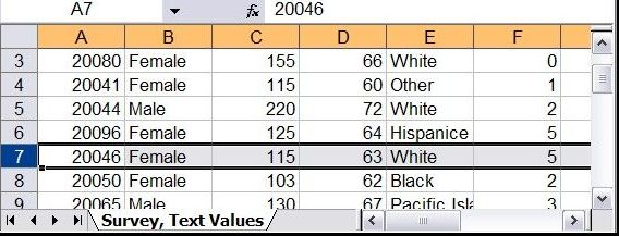
Before we figure out how Excel can do this automatically let's simply do it by hand. Inspecting the data we see that there are 5 categories, White, Black, Hispanic, Pacific Islander, and Other. We type these categories into an empty part of the Excel spreadsheet and manually count how many people in each category are contained in our data. We add these counts, or frequencies, next to each category manually:
Now it should be easy to create the appropriate bar chart - make sure to do it, it works just as described in the previous section on creating simple bar charts.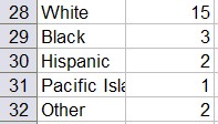
Our manual procedure barely worked because we did not have that much data. For large data sets we need to figure out an automatic procedure to create a table of frequencies and the associated bar chart. Fortunately, Excel has just such a procedure, called a Pivot Table. The Pivot tool is found as the first button of the "Insert" ribbon. It looks slightly different depending on the version of Excel but the differences are pretty minor and you should be able to figure it out. For detailed assistance - if you are using Excel 2007 - you could try this helpful video.
The Pivot tool is actually a lot more flexible than we will need in our course, but it will for sure create the type of tables that we will be interested in. We will, in fact, see that tool again subsequent sections.
- Load the above spreadsheet into Excel and click anywhere outside the data area, for example below the last row of data. If you don't put the cursor into a free cell, the Pivot tool will be disabled.
- Select "Insert" -> "Pivot Table" and choose the entire data table for the Inpout/Range field, using the by now familiar range selector. Make sure to pick the entire data table, including the first row containing labels.
- You can choose to put the resulting pivot table into a new spreadsheet, but for now we can just leave it at the bottom of the data range.
- Click "Okay" to generate the pivot table (which will initially be empty)
You will see a "potential frequency/percentage table" containing labels such as "Drop Row Field Here", "Drop Column Fields Here", etc., but no data values are yet contained in the table. There will also be a window called "Field List" containing the available variables from your data, in our case "ID", "Sex", "Weight", "Height", "Race", etc. You can "drag-and-drop" these variables to the various slots in the table to create a variety of useful tables for data analysis.
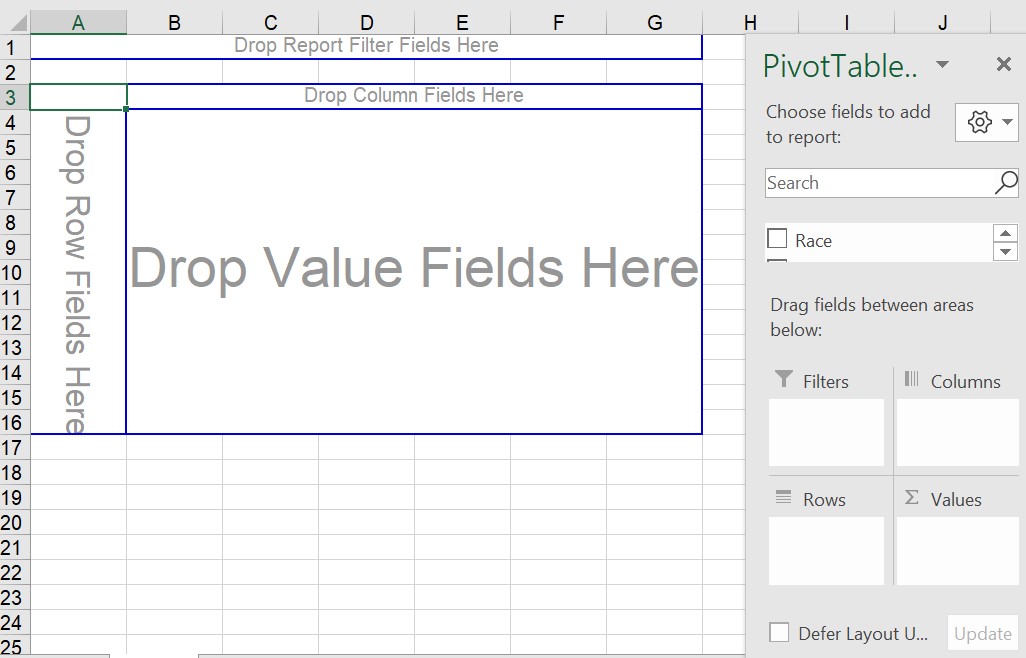
- Drag the variable "Race" from the field list into
the "Drop Row Fields" area of the table. Your table will adjust,
showing you all available "Race" categories but as for now no
frequencies (counts) yet.
- Next, again drag the variable "Race" from the field list, but this time drag it to the "Drop Data" or "Value" area in the middle.
You will finally see the counts of how many occurrences fell inside each race category, which of course will turn out similar to the one we created manually before, except this time it includes the "blank" category (and the order may be different.
For extra credit, see if you can eliminate the "blank" response row. Hint: maybe you can find a drop-down menu somewhere where you can 'uncheck' unwanted categories. Also, when you double-click the "Count of race" label in the table you can specify exactly what type of counts should be shown and in which way it should be formatted. Try for example to get your counts to appear as percent of the overall total.
- You can now create the bar chart as usual, including or excluding the blank response as you see fit. But it is even easier: if you position your cursor inside the "pivot" table, an "Analyze" ribbon will appear as one of the "Pivot Tools" - it will contain a "Pivot Chart" button, use that to create a chart.
In subsequent sections we'll revisit the Pivot Table tool and investigate additional options and possibilities. If you have problems with the Pivot tool so far, you might want to check out the following video:
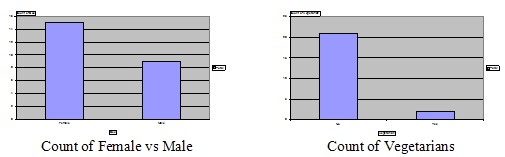
Exercise: Please practice using the same data set and create:
- a bar chart representing the number of males and females in the survey
- a bar chart representing the number of vegetarians in the survey
- For review, create a histogram for "weight". The obstacle here will be that there is one (or more) blank data points for this variable.
- The more review, create a histogram for "height". In this case you will notice that one guy entered 5 as height, which does not make sense compared to all the other data points. What should you do with this exceptional value?
The last two questions require a good old histogram, which we have covered before. The appearent problems with this will be discussed in a homework.