 MathCS.org - Statistics
4.6 Box Plot and Skewed Distributions
By now we have a multitude of numerical descriptive statistics that describe some feature of a data set of values: mean, median, range, variance, quartiles, percentiles, ranks, etc. There are, in fact, so many different descriptors that it is going to be convenient to collect many of them in a suitable graph called the Box Plot.
The Box Plot, sometimes also called "box and whiskers plot", combines the minimum and maximum values (and therefore the range) with the quartiles into one useful graph. It consists of a horizontal line, drawn according to scale, from the minimum to the maximum data value, and a box drawn from the lower to upper quartile with a vertical line marking the median.
It might sound pretty convoluted, so to see how it works it is best to consider an example.
Example: In an earlier example we considered the following cotinine levels of 40 smokers. Draw a box plot for that data.
0 87 173 253 1 103 173 265 1 112 198 266 3 121 208 277 17 123 210 284 32 130 222 289 35 131 227 290 44 149 234 313 48 164 245 477 86 167 250 491
We already computed the lower and upper quartiles to be Q1 = 86.5 and Q3 = 251.5, respectively. It is easy to see that the minimum is 0 and the maximum is 491. A quick computation shows that the median is 170. The corresponding box plot looks therefore as follows:
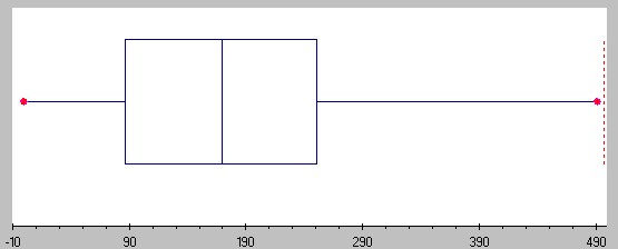
You can see that the horizontal line (sometimes called the "whiskers") goes from 0 to 491 (from min to max), while the box extends from 86.5 (= Q1) to 251.5 (= Q3) with a middle vertical line at 170 (the median).
Drawing a Box Plot with Excel
Unfortunately Excel does not have a nice build-in facility to quickly create a box plot. You could of course use the formulas "max(RANGE)", "min(RANGE)" together with "PERCENTILE(RANGE, 0.25)", "PERCENTILE(RANGE, 0.75)" and "median(RANGE)" and then draw a box plot by hand. However, I found an easy-to-use Excel template that is not quite as convenient as the Data Analysis tools we've been using, but should still be pretty simple and useful.
To use the Excel Box Plot template, click on the icon below to download the file:
When you open the file, Excel will show you a worksheet with a finished box plot already, and a column on the right in green where you can enter or paste your data. Simply delete the data currently in that column and replace it with your new data to create a new plot. The box plot will update automatically.
Example: Create a box plot for the Life Expectancy by country that we considered before.
We first need to open the Life Expectancy data file - click on the icon below for the data file.
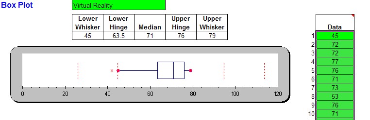
When the spreadsheet opens up, mark all numeric data in column B (the Life Expectancy column) but not including the codlumn header and copy them to the clipboard (for example, press CTRL-C). Then open the boxplot.xls spreadsheet and position your cursor to the first data value in column M. Paste the copied data values (for example, press CTRL-V) into that column and the box plot will automatically update itself so that you should see the following picture:
For some data sets you will see some points beyond the max/min value of the whisker. Those points are outliers; they are exceptionally small or large as compared to the rest of the data. Technically these outliers are the max/min, but they would distort the box plot too much. The exact definition of an outlier will be provided below.
Note that the difference between the upper and lower quartile is called the Inter Quartile Range, or IQR. It is used to define outliers (see below).
Example: Find the IQR for the Life Expectancy data above.
We know from the above box plot that the "lower hinge" is 63.5 and the upper hinge is 76. By definition, that means that the quartiles are Q1 = 63.5 and Q3 = 76. That makes the Inter Quartile Range IQR = 76 - 63.5 = 12.5
Box Plot and Distributions
In addition to giving you a quick view of the range, the quartiles, and the median, the picture also indicates that if we were to draw a histogram for this data it would look slightly skewed to the left because the box in the box plot is a little towards the right side (yes I know, this looks like a typo but it isn't: a distribution is skewed to the left if the box is on the right side, and skewed to the right if the box is on the left side. In fact, even though the box plot does not directly contain the mean (it only shows the median) it is possible to estimate whether the mean is less than or greater than the median by looking whether the box plot is skewed to the left or to the right.
First, let's look again at histograms and define what we mean by "skewed" histograms (and distributions):
A histogram (distribution) is called
if it looks similar to a "bell curve".
Most data points fall in the middle, |
|
| A histogram (distribution) is called
if it looks like a bell curve with a
Most data points fall to the left of the |
|
| A histogram (distribution) is called
if it looks like a bell curve with a
Most data points fall to the right of the |
|
You can tell the shape of the histogram (distribution) - in many cases at least - by just looking the box plot, and you can also estimate whether the mean is less than or greater than the median. Recall that the mean is impacted by especially large or small values, even if there are just a few of them, while the median is more stable with respect to exceptional values. Therefore:
- If the distribution is normal, there are few exceptionally large or small values. The mean will be about the same as the median, and the box plot will look symmetric.
- If the distribution is skewed to the right most values are 'small', but there are a few exceptionally large ones. Those large exceptional values will impact the mean and pull it to the right, so that the mean will be greater than the median. The box plot will look as if the box was shifted to the left so that the right tail will be longer, and the median will be closer to the left line of the box in the box plot.
- If the distribution is skewed to the left, most values are 'large', but there are a few exceptionally small ones. Those exceptional values will impact the mean and pull it to the left, so that the mean will be less than the median. The box plot will look as if the box was shifted to the right so that the left tail will be longer, and the median will be closer to the right line of the box in the box plot.
As a quick way to remember skewedness:
- longer tail on the left means skewed to the left means mean on the left of median (smaller)
- longer tail on the right means skewed to the right means mean on the right of median (larger)
- tails equally long means normal means mean about equal to median>
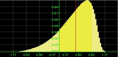
Example: Here is some (fictitious) data in an Excel sheet for three variables named varA, varB, and varC.
Create a box plot for the data from each variable and decide, based on that box plot, whether the distribution of values is normal, skewed to the left or skewed to the right, and estimate the value of the mean in relation to the median. Then compute the values and compare them with your conjector.
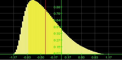
One of the data columns results in the following box plot and interpretation based on it:
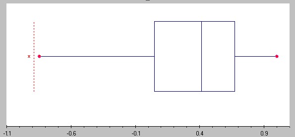
Distribution is shifted to the left, the mean should be less than median (the exact numbers are: mean = 0.3319, median = 0.4124).
The other data column has the following box plot and interpretation based on it:
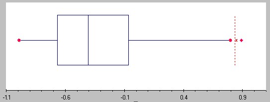
Distribution is shifted to the right, the mean should be greater than the median (the exact numbers are: mean = -0.3192, median = -0.4061)
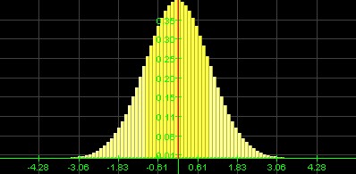
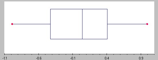
The final data column has the following box plot and interpretation based on it:
Distribution is (approximately) normal, mean and median should be similar (the exact numbers are: mean = 0.013 median = 0.041)
Unfortunately I forgot to write down which of these cases correspond to varA, varB, and varC - can you figure it out -:)
Box Plot, Outliers, and Standard Deviation
We have seen that even though the box plot does not explicitely include the mean, it is possible to get an approximate idea about it by comparing it against the median and the skewness of the box plot:
- if the distribution is skewed to the left, the mean is less than the median
- if the distribution is skewed to the right, the mean is bigger than the median
In a somewhat similar fashion you can estimate the standard deviation based on the box plot:
- the standard deviation is approximately equal to the range / 4
- the standard deviation is approximately equal to 3/4 * IQR
Both estimates work best for normal distribution, i.e. distributions that are not skewed, and the first approximation works best if they are no outliers. We will later determine additional relations between the standard deviation for normally distributed data.That reminds me: another useful application for the IQR is to define outliers:
- outliers are data points that fall below Q1-1.5*IQR or above Q3+1.5*IQR
Example: Consider the above data on cotinine levels of 40 smokers. Find the IQR and use it to estimate the standard deviation. Also, identify any outliers.
The data ranges rom 0 to 491 (from min to max), while the Q1 = 86.5 and Q3 = 251. Thus, we have two estimates for the standard deviation:
- s is approximately equal to range / 4 = 491 / 4 = 122.75
- s is approximately equal to 3/4 * IQR = 0.75*(251-86.5) = 123.375
The estimate are pretty close and since the true standard deviation is 119.5, they are both pretty close to the actual value. The best part of these estimates is, however, that they are so very simple to compute and thus they give you a quick ballpark estimate for the standard deviation.
As for any outliers, they would be data values:
- above Q3 + 1.5*IQR = 251 + 1.5 * 164.5 = 497.75: none
- below Q1 - 1.5*IQR = 86.5 - 1.5 * 164.5 = -160.1: none
So there are no outliers in this case (which is one reason why the estimate of range/ 4 works prertty well).
Example: Find all outliers for the life expectancy data above.
For that data set we found that IQR = 76 - 63.5 = 12.5 and therefore outliers woukd be data values:
- above Q3 + 1.5*IQR = 76 + 1.5 * 12.5 = 94.75
- below Q1 - 1.5*IQR = 63.5 - 1.5 * 12.5 = 44.75
Thus, the three data points for Uganda (42), Cent. Afri. R (43), and Tanzania (43) are outliers below, while there are no outliers above. Note that since there are outliers, the range/4 estimate for the standard deviation should not work as well as the estimate based on the IQR. Confirm that!